ALEXIA WUNDER
Medication Filters
As design lead for Medications on VA.gov, I worked to improve how Veterans find and manage their prescriptions online. Our team introduced a filter component to help Veterans quickly locate medications and ensure the experience met VA’s accessibility and usability standards.

THE PROJECT
My Role
As UX Design Lead, I led the UX strategy and design for VA.gov’s Medications project, focusing on improving findability and accessibility for Veterans.
The Team
Contractors: 1 junior designer, researcher, accessibility specialist, front and back end developers, QA testers delivery manager, project manager
Client: Design lead, product owner
Governance team: Content, IA, accessibility, design system representatives
Duration
February 2024 to July 2025
Tools
-
Figma
-
Mural
-
Miro
-
MS Teams
-
Zoom
-
Slack
THE PROBLEM
Veterans using the Medications on VA.gov tool may struggle to locate medications within their likely extensive list of historical medications, especially when managing multiple prescriptions, potentially causing frustration and confusion during critical moments of their healthcare journey.
THE SOLUTION
-
Filters
-
Grouped prescriptions
THE VETERANS
-
Primarily older adults, with the largest age group aged 65 and above
-
Many have limited digital literacy or comfort with technology
-
A significant portion live in rural areas with limited internet access
-
Some experience physical or cognitive challenges related to aging or military service
-
Typically manage 12–15 active prescriptions at a time
DESIGN PROCESS
Discovery Research
-
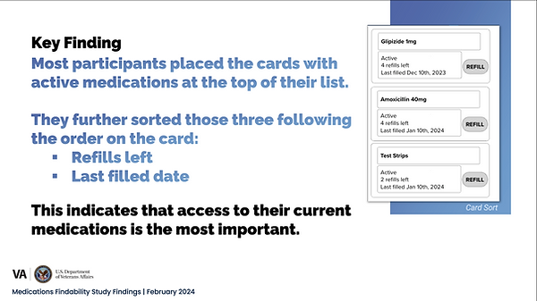
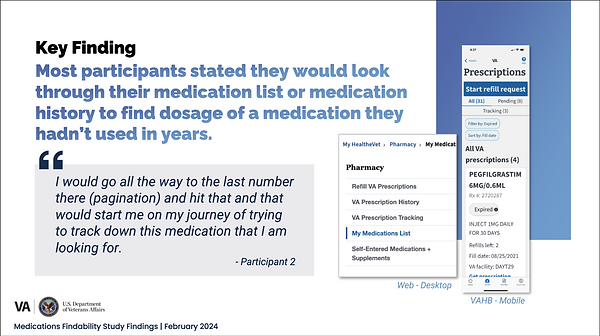
Early feedback indicated that Veterans struggled to find specific medications within lengthy lists.
-
Our researcher (Anne Kennedy) conducted discovery research to understand the underlying causes of this findability issue.


Brainstorming
-
Organized a cross-team brainstorming session to explore solutions to the findability problem
-
Facilitated activities such as Crazy 8s and 3-12-3 to encourage rapid ideation and collaboration
-
Identified overlapping concepts and refined ideas that multiple designers had in common
-
Expanded on common themes included reorganizing the medication list through tabs, separate sections or pages, search, and filters


Ideation
Opted not to add search, since medication names are often long and difficult to spell, leading to poor usability.

Chose not to use tabs, as they needed more research to meet accessibility requirements.

Avoided multiple pages because the legacy experience did this and caused confusion. Veterans thought medications disappeared, when they simply expired and moved to the history page.

Design
Ultimately, we decided to continue exploring filter options as a more intuitive way to help users find medications.
-
Filters leveraged existing design system components to maintain consistency and efficiency.
-
Collaborated with other teams, including the mobile app and secure messaging teams, to align on similar filter patterns and functionality.
I guided designs by asking questions:
What else is affected by the addition of filters?
We also had to modify downloads and prints of all the pages.
Is this technically feasible? Are there performance constraints with loading/filtering large datasets?
I made sure the designer met with the front end developers early and often.
When/Should the filters reset?
After some competitive analysis, we decided that filters will reset after each session. Within the session, if a user has filters applied, then navigates anywhere else on VA.gov, the selected filters will remain.
Should the filter be combined with the sort feature?
We ultimately separated the two to keep the experience simpler and easier to understand.

Have the micro interactions been considered? Where should the focus land after filters are applied?
We made sure to consider how the list would load.

What filter categories are most relevant (e.g., medication type, dosage, refill status, prescribing provider)?
After reviewing research, and meeting with developers, unfortunately we could only filter by medication status.

Are we using Plain Language content?
Because Veterans didn’t always understand the existing status labels (inherited from the legacy product), we collaborated with the content team to add short descriptions that clarified their meaning without disrupting familiar terminology.

Should we use "and" or "or" logic (checkboxes or radio buttons)?
We explored both options, ultimately choosing radio buttons for simplicity as one medication can be found in multiple sections.

Is there a clear way to reset or remove filters?
To help Veterans feel confident exploring filters, we included a reset button that easily brings them back to the default state.

"Final" Designs
Are we compliant with WCAG and Section 508?
We worked with the Accessibility Specialist, Bobby Bailey, early in the project and for a final audit. In this example, after a Veteran applies a filter or sort, focus moves to the “Showing # to # of # medications…” message, providing clear feedback about which filter was applied.

Did we consider all possible use cases?
To ensure we covered all possible use cases, I worked with the designer to create detailed flowcharts. In this example, Veterans receive feedback when a selected filter returns no medications.

Are we ready to launch?
We tested the filters in the staging environment across multiple devices to ensure they worked as expected before release. After receiving approvals from the client and governance team, filters were ready for production.

More Research
The client opted to release the filters first and evaluate their effectiveness through usage data and feedback.
While there were positives, Medallia survey and Data Dog analytics indicated low engagement with the filters.
(Research conducted by Anne Kennedy)


Iterate (Quick Fix)
In an effort to draw more attention to the new feature, we introduced an In-Product Education component to improve medication findability, using a solution developed by the Secure Messaging team (Joel Calumpong, Emily Taylor, Ben Caldwell).
The IPE was ultimately placed below the filter based on the client design lead’s preference.

Even More Research
We partnered with the research team to conduct:
-
Accessibility testing of the In-Product Education (IPE) component to ensure it met VA accessibility standards
-
A/B testing to evaluate the most effective placement of the IPE within the medication list interface
Unfortunately, blind screen reader users didn’t benefit from the IPE.

We then provided the research team with two additional options to test: the IPE above the filter, below the filter, and expanding the filter accordion by default to increase visibility.
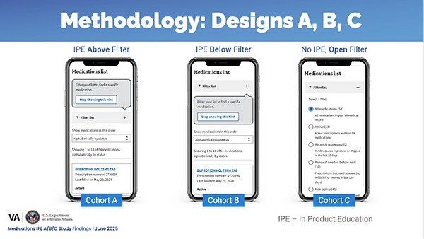
The findings from this study didn’t solidly point in a single direction.

Iterate (Again...)
Unfortunately, our contract ended shortly after completing the final round of research. Had we been able to continue, we planned to build on those findings by exploring alternative and custom VA components, refining content through usability testing, and deepening our focus on accessibility.
OUTCOMES AND LESSONS LEARNED
While the filter feature still has work to do, this effort and research helped us to improve findability. Through Medallia data analysis and collaboration with our research team, we discovered that many Veterans were confusing older instances of the same prescription. This insight led us to redesign how medications were displayed. We grouped all instances and refills into a single card, with past versions accessible from the details page.
This change significantly reduced the list, making it easier to scan, navigate, and find active prescriptions. It also reinforced a key lesson: simplifying structure and aligning it with Veterans’ mental models can have a greater impact on usability than adding new features.